Tag Archives: experience design

retail tech outlook

The big news over the past couple of weeks in the retail and fashion tech space was of course the concept of Amazon drones, but multiple other stories grabbed the headlines too. Here’s a highlight of the best ones…

instagram-direct-2

  • IBM’s Watson explores the great e-commerce unknown with The North Face [AdAge]
  • What Instagram Direct means for fashion brands (as pictured) [Fashionista]
  • Barneys creates holiday .gif guide to appeal to younger consumers [Luxury Daily]
  • Harrods’ Christmas Weibo campaign engages London’s Chinese tourist influx [Jing Daily]
  • Karmaloop targets millennials with YouTube and Snapchat holiday plan [AdWeek]
  • Kmart’s ‘Ship My Pants’ gets the Dickens treatment for Christmas [AdAge]
  • Native advertising: the pros and cons [WWD]
  • Designing the next generation of wearables, with women in mind [Fast Company]
  • With 3-D printing, clothing that leaves out the sewing machine [NY Times]
  • Mallzee is a Tinder-esque shopping app that lets your friends play fashion police [TechCrunch]
  • Start-up Thread is building a scalable personal styling service, blending human stylists and intelligent algorithms [BoF]
  • Instagram is the ‘best platform for brands’ in 2013, beating out Facebook, Twitter, and Google+ [Venture Beat]
  • Retailers look to their best customers, not bloggers, as the new influencers [Fashionista]
  • Gap’s ad with Sikh model Waris Ahluwalia defaced with racist graffiti, drawing incredible response from company [Huffington Post]

(Reblogged from Fashion and Mash)

regis pean + omni//form is a strategic architecture and design firm creating
experience based design around the world
Tagged , , , ,

consumer engagement

Retail is entertainment now. We realize that today’s customers want more than product on display. They want stories to explore, communities to connect to, fun, excitement and surprise.  A trip to a retail store is expected to be a continuous discovery. What’s new? is not a question but a demand. And brands have to cater to it to stay in the game.

As product launches and visual stories have quantitative limitations ( per year/per season) it has become an unwritten rule to success to include other forms of engagement to quench the consumer’s increasing thirst for stimulation. The demand for innovative concepts is pushing designers and think tanks to generate constant surprises with a “never-seen-that-before” idea. Often this innovation is replaced by any type of gadget with the hope that technology itself will be the saver. But unless put into a relevant context to the brand story those gadgets often remain unused and ignored (think iPads with irrelevant or boring content).

Here are some better examples of tech gadgets:

QR code activation

The clever part of QR codes is that it requires no hardware ( and with that no maintenance) on the store side. The QR code is on the visual and the consumer activates it with their own handheld device to access the digital side of the brand.


url-2

This actually works! The good part here is that it is coupled with a printer, so the personalized remedy for your skin prints out as a recipe to take to the counter for purchase and eventually home with you (so you wont forget!)


Smashbox Arnotts Dublin

We have seen a lot of these photo booths pop-up recently. They draw a lot of attention, especially with younger customers.  However, rarely are they relevant to the brand they promote.

We thought a fitting place for this would be a brand that is rooted in photography? So we included the photo booth into a setup for Smashbox Cosmetics, a brand that was actually founded in a photo studio. It infuses fun and allows for upload to social media and print outs to take home. Created-tested-photographed at Smashbox.


Barneys_NewYork_table

This dining table is a touchscreen. You order what you want to eat and while you wait for your food  you can browse and shop from the store the restaurant is attached to.


Apple

When your product is the tech gadget all you need to do is place it on a table and make it accessible. Immediate interactivity.


There are many advocates  for high-tech solutions, but in my experience the simple is often the better. The more intuitive the better. The less technical the more fail save.

Engagement can also mean low tech. Addressing senses to create a multilayered memory. Wether it is a scent, a sound, a touch those can all augment the experience.

Lego

What is more fun than playing with the product? Instant engagement!


Lunx

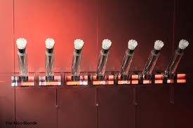
Smell triggers emotions and memories. In the world of beauty lots of products are chosen by consumers for their smell, which often is only a by-product of the formula. Making the fragrance a touch point creates an indirect engagement with the affiliated product.


omni//form for Mac cosmetics

These displays are soft and squeezable. I designed these years ago to create a haptic memory in customers. The unexpectedness of the touch created lasting memories (and conversations!) Products for skin care  and beauty displayed on organic shaped skins. Hand mirrors in unexpected shapes fit perfectly into ones hands creating a “feel-good” moment.


sheraton

Sound: One can plug-in their portable music device into these rocking chairs and sound comes out of the back. Fun to experience and surprising. We designed this for a hotel lobby.


These are some examples of tactics of consumer engagement, however the most effective way is still the oldest and most traditional one: the human exchange. Nothing compares to a smile and a great advice from a knowledgeable sales person if you want your consumer to love your brand. No design can beat that.

Tagged , , , , ,

the importance of the experience

Human perception is built from experiences. Experience as a general concept comprises knowledge of or skill of some thing or some event gained through involvement in or exposure to that thing or event. The word “experience” may refer to mentally unprocessed immediately perceived events.One may also differentiate between physical, mental, emotional, spiritual and virtual experiences.

images

For all matter the experience is directly connected to the emotional memory imprint we take a way from a lived situation and therefore of essence when pre-defined to achieve the goal of connecting a human to a specific situation, space, object or story.

When we design spaces, whether they are for residential or commercial purposes, we are setting the stage for the experiences that will happen to people, who will be using them. In the case of a theater the stage is exactly tailored to the story of the play with the goal to support or even enhance the story.

Retail, for example, is not much different. The more defined the story is, the more specific the space can be designed to enhance it. It is therefore essential to successful retail design to go beyond space and furniture planning, to a place, where the story, that will be told, is defined primarily.What good is a pretty store if the story is not told well and no emotions evoked?

images-3

The story, that defines the brand, is ultimately what will drive the experience the brand wants their consumers to have.

At omni//form we have developed this process over years.We story board,animate or write out the experience. It involves a deeper understanding of human behavior, trends and fads in various cultural context. We try to think like the people, who will use our designs and research their likings, preferences, habits and rituals. For that we constantly update our global consciousness of cultural and sociological developments and trends. It allows us to create a vision around the scenarios that we have to accommodate and gives us a leading principle to the design development.

I believe that good design starts with interest for its user. It emerges out of consideration to create experiences that leave a positive emotional memory. That is what will make everyone return for more.

images-1

who do YOU think could improve their retail experience? – leave us a note.

regis pean + omni//form is a strategic architecture and design firm creating
experience based design around the world

Tagged , , , , , , , , ,

Richard Branson on the Importance of Design

No matter what industry you’re working in, if your business sells services, your ultimate goal is making your customers happy. At Virgin, we’ve always found that our front-line employees play a big role in that, with their cheerfulness, patience, resourcefulness, and dedication to listening to customers. But no matter how good they are, your staff will need you to set the stage for a great customer experience with good design — by providing a space that you, your employees and your customers love to be in.

A well-designed space immediately says that you care about the details and that you want to contribute something fun and meaningful to your customers’ lives — it will help them to relax and talk about what they’re looking for. We learned this accidentally, and early on — at our first storefront, in fact.

Our first Virgin Records store in London, which opened in 1971, was essentially a place for us to listen to music and meet new friends. It featured listening stations where customers could play records before buying them and beanbag chairs so that everyone could hang out. From that experience, my friends and I realized how important it was to create inviting, unique spaces that bring people together to discuss what they are passionate about: music, mobile apps, travel, even banking.

Yes, banking! When we launched Virgin Money in Britain, one of our newest businesses, we faced the challenge of making banking both fun and meaningful for customers. Our team’s answer was to offer people the opportunity to integrate banking into their everyday lives by eliminating lines and teller windows: The banks are designed to resemble living rooms, with both comfortable seating and work areas so that customers can use the space to meet friends, colleagues or our representatives. They can set up their laptops and use the space to do some work whenever they like, taking advantage of the free Wi-Fi, power outlets and newspapers we offer.

When you are designing your space, think about the problems that your customers are depending on you to solve. Many of our spaces address specific issues. For example, some people waiting in airports would prefer to spend their time productively, while others just want to relax, so we targeted both groups’ needs when we made our plans for Virgin America’s Terminal 2 at San Francisco International Airport.

For business travelers, we included Wi-Fi, power outlets and plentiful seating so that they can be as productive on the ground as they are in the air. For people more interested in recreation, we built a yoga room, a lounge with plentiful food and beverage choices, and shops featuring the best of San Francisco’s markets and chefs. We’ve heard from customers that T2 makes the airport an experience to look forward to, rather than just another stop along a tiring journey.

Remember, when it comes to design, it’s rare that one size fits all. Since the types of customers for your services may vary from location to location, you must be flexible. And as always, be sure to ask your front-line staff for ideas and get their thoughts on proposed designs. We have Virgin Active health clubs all over the world, and while they share common values, we encourage franchise owners to customize each club to fit the local community’s needs.

For example, many of our gyms in residential neighborhoods have terrific kid zones where children can be looked after while their parents work out. This allows multitasking moms and dads to get a break so that they can exercise — and relax afterward, too. Virgin Active Soweto, by contrast, serves many business commuters, so it operates a hair salon: After a good workout, people will look as good as they feel.

Even if you are putting everything you’ve got into just getting your startup off the ground, design is not an area where you should stint. The thought, effort and love you put into your business space shows your respect and consideration for your customers — the building blocks of great service. Relaxed, happy customers who know they are valued are more likely to engage with your staff, ask questions and find solutions tailored to their needs.

Have you walked into a store recently that made you feel comfortable, productive, healthy and happy? How did it make you feel about the company? What do such spaces all have in common? Entrepreneurs, tell me about your design challenge on Twitter, @richardbranson.

http://www.entrepreneur.com/article/225685

Tagged , , , ,

Get them in! strategic planning_part 1

One of the most important questions for every shop owner is: how do I get customers to come into my shop? I would like to analyze two very different strategic approaches on how a storefront design can support a potential customers decision.

The first storefront example is the one of the stores omni//form designed for French jeweler “Mauboussin” in Singapore (see previous post for more on that store).

First we took a very atypical approach to the storefront by making it floor-to-ceiling glass. Jewelry stores are usually closed off or “shielded” to convey secured value and provide privacy to a customer, who is ready to spend money. This brand’s aim is to deconstruct that old fashioned notion and instead to reposition itself as being fashionable, young and accessible. The openness of the facade is the first tactic to convey this message.

The second tactic is the logo. It’s the far communicator. Its size is readable from across the street. It sits on a bar that not only illuminates it for better reading but that also guides the eye to the entrance door. The logo acts as an underlined title to the display window area below.

Next is the store front content, which is structured in 3 layers or tactics:

1-The immediate window display plays on the notion of discovery. Open displays -“treasure boxes”- are setup for discovery and tease the viewer with select merchandise. They are internally lit and thus each create a highlight that draws attention.

2-The feather curtain acts as a back drop to the window displays to isolate them out of the interior context but simultaneously allows a peek into the vestibule of the boutique because of its sheer quality. The space behind is conceived around a central cascading chandelier fixture over product displays, which serves as focal point. This visual magnet can be “previewed” from outside to generate interest and desire to enter and explore.

3-The interior of the store can be glimpsed at from outside through two openings from the vestibule. This is crucial for a jewelry store that would typically suffer from what I call “threshold angst” as a hesitance to enter in fear of being engaged with an environment that does not suit the customer’s financial status. In this case the guard is down and customers can see what it is like inside, deconstructing the angst upfront. It also re-enforces the notion of an all inclusiveness supporting the brand message of accessibility.

The overall theme for this design was accessibility and discovery in a attempt to recruit a broader customer range.

A very contrary example to this is a store front we designed years earlier before the brand decided to change its positioning. This store was built in New York, on Madison Avenue. The aim was to convey exclusivity and a secure environment for precious goods. It was in line with the expected customer in this neighborhood, where the most exclusive stores settle and people come to spend money.

regis pean+omni//form strategic planning example

Here the logo was reduced to a decent hint to communicate exclusivity.

The storefront communicates a curated selection of merchandise but does not offer additional layered information.  The inside of the boutique remains an experience to explore for the ones who dare or belong.

The entrance is marked by a bright and sparkling opening in the otherwise dark store front.  Full glass doors offer a peek into a glitzy vestibule, which leads the way to the real entrance door further in. The passing of two door thresholds was introduced to re-enforce the ideas of safety and privacy.

The shop window displays draw attention similar to the first example. Bright lights create contrast and highlights for the eyes to fall on. Brand iconic treasure boxes are opened up for discovery. Here is where the brand communicates its offering. But additional information is very limited: cropped openings in the back drop around the displays allow for a peek into the vestibule behind and the ones, who look carefully through the center opening, as it aligns with the entrance door behind, are rewarded with a peek into the boutique. The goal was to  raise interest and desire to explore the tease. The theme in this example plays on intriguing luxury for the Madison Avenue customer.

Both examples show how strategic design tactics can create very opposite effects while achieving the same goal: to get customers into the store!

Tagged , , , , , , , , ,